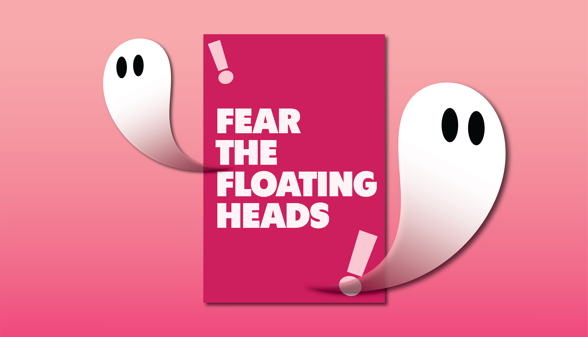
Fear The Floating Heads
Now more than ever, movie posters are beginning to look the same in the film industry whereas this wasn’t necessarily the case decades ago, but why?
Floating Heads?
Yes, you read that headline right. The movie poster industry has fallen under the curse of cutting out the main characters’ heads from a certain movie and placing them in a collage configuration that does not tell the viewer anything about the plot of the movie or what the movie is about. As a result, all of the movie posters that use this technique make their main characters look like they have floating heads, and the designs look the same without any unique or eye-catching elements.
The Nonstop Nerd blog explains this well by saying this style of poster design “doesn’t affect the quality of the movies at all, but they definitely don’t advertise them well.” Part of a movie is the advertising process and getting people excited to see the movie, but if movie posters begin to look more similar, it says a lot about the studio and the time and detail that goes into the poster design. Additionally, “studios who do this are lucky they can afford to get great trailers out there because these posters don’t do much to attract moviegoers to their film” (Nonstop Nerd). This continues to emphasize that to get people excited about a movie, studios should take a step away from the safe option of “floating heads” and take a chance in the accurate portrayal of the movie through poster design.
Movie Posters as An Art Form
Movie poster designs that stand out to the viewer and do a successful job of getting people excited about a movie are fulfilling their job of accurately portraying the movie and advertising it to different audiences. However, movie posters don’t need to be complex in order to be effective, in fact, there are some great examples of more simplistic posters that successfully portray the movie.
An example of a poster design that falls under this category is for the movie Jaws where it emphasizes the eerie and suspenseful themes featured in the movie while also giving the viewer just the right amount of information about what the movie is about.
Another example can be seen through the Asteroid City movie poster which contains the vibrant colors featured in the movie and is eye-catching without giving away the story and does not look like every other poster. Specifically with this poster design, without any context into what the movie is about, it can intrigue the viewer into wanting to see it to find out more about the context behind the poster design decisions.
I own a movie poster because I previously worked at a movie theater and there was an extra one that I was able to take home. I think it is a cool thing to own and hang up on my wall, however, it consists of the floating heads mentioned earlier.
Ultimately, in the world of streaming, when someone is scrolling through options on what to watch, the designer should take into consideration the other poster designs that will be on either side of it and decide how to make sure their poster design stands out against the other movies a person is deciding to watch. There is still hope for movie poster designs and not everyone falling victim to floating heads, but designers should deeply consider what will grab their audience’s attention and stand out amongst their competitors.
Hi! I’m Amanda Riha!
I’m a graphic designer with a background in advertising and psychology and have a passion for being creative and building connections with those around me.
When I’m not designing, you can find me reading as many books as I possibly can or spending time outside!


