Better Tomorrow Therapy Social Media
My Role: Research, Social Media Strategy, Design
Tools: Pinterest, Adobe Illustrator, Instagram
Timeline: June 2023 - August 2023
Background
Better Tomorrow Therapy is a therapy practice based in South Carolina with a social media presence revolving around reducing the stigma of being a parent as well as a caregiver to a child with disabilities, known as being a parent caregiver. This practice has a focus on the mental health of parent caregivers since it is often overlooked in society as well as the mental health of children who have siblings with medical needs or disabilities and the support they can get from others. Specifically on social media, a community surrounding the mental health of parent caregivers has been created and it gives a space for parents to come together where support can be given and limiting the spread of misinformation on the topic.
The Process
Problem Statement
When it comes to the amount of information that can be found online regarding the topic of parent caregivers, there isn’t much surrounding mental health and the support they need for the roles they take on. In fact, there is a lot of misinformation coming from people who are not professionals in the field that can confuse readers or make them believe the wrong thing. My goal was to make sure the correct information was being shared while working with a professional family therapist, make the content easy to follow, and get the correct messaging across through the designs and captions of each social media post.
Objective
To limit the misinformation being spread about being a parent caregiver to a child with disabilities and spread more positivity and support to those in that position.
Research
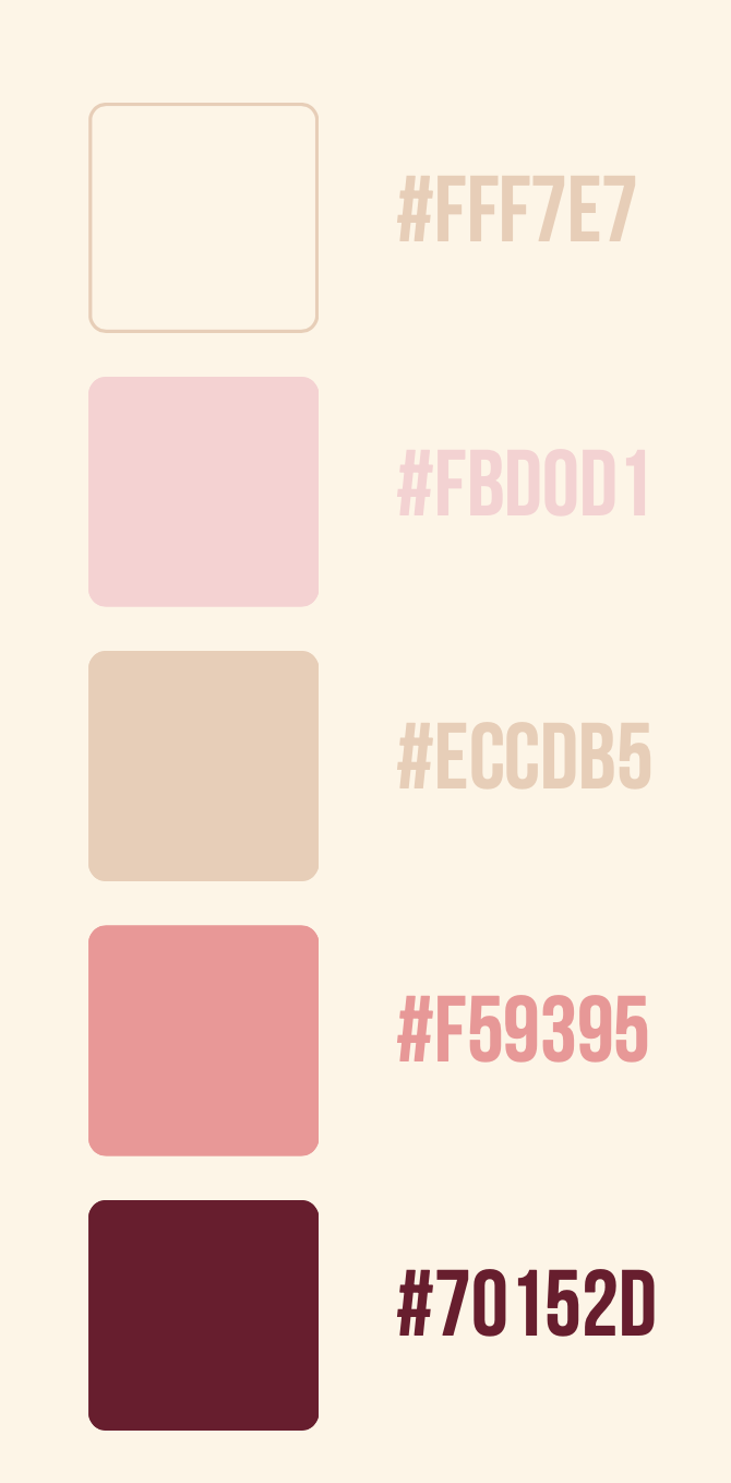
I began my brand identity journey by doing research on the previous posts on the Instagram account as well as taking note of which posts performed well, which ones didn't, and why. I quickly recognized that the previous posts contained lighter colors, including pink, which I then incorporated into the posts I designed to stay consistent in the social media presence that was already established.
Brand Identity
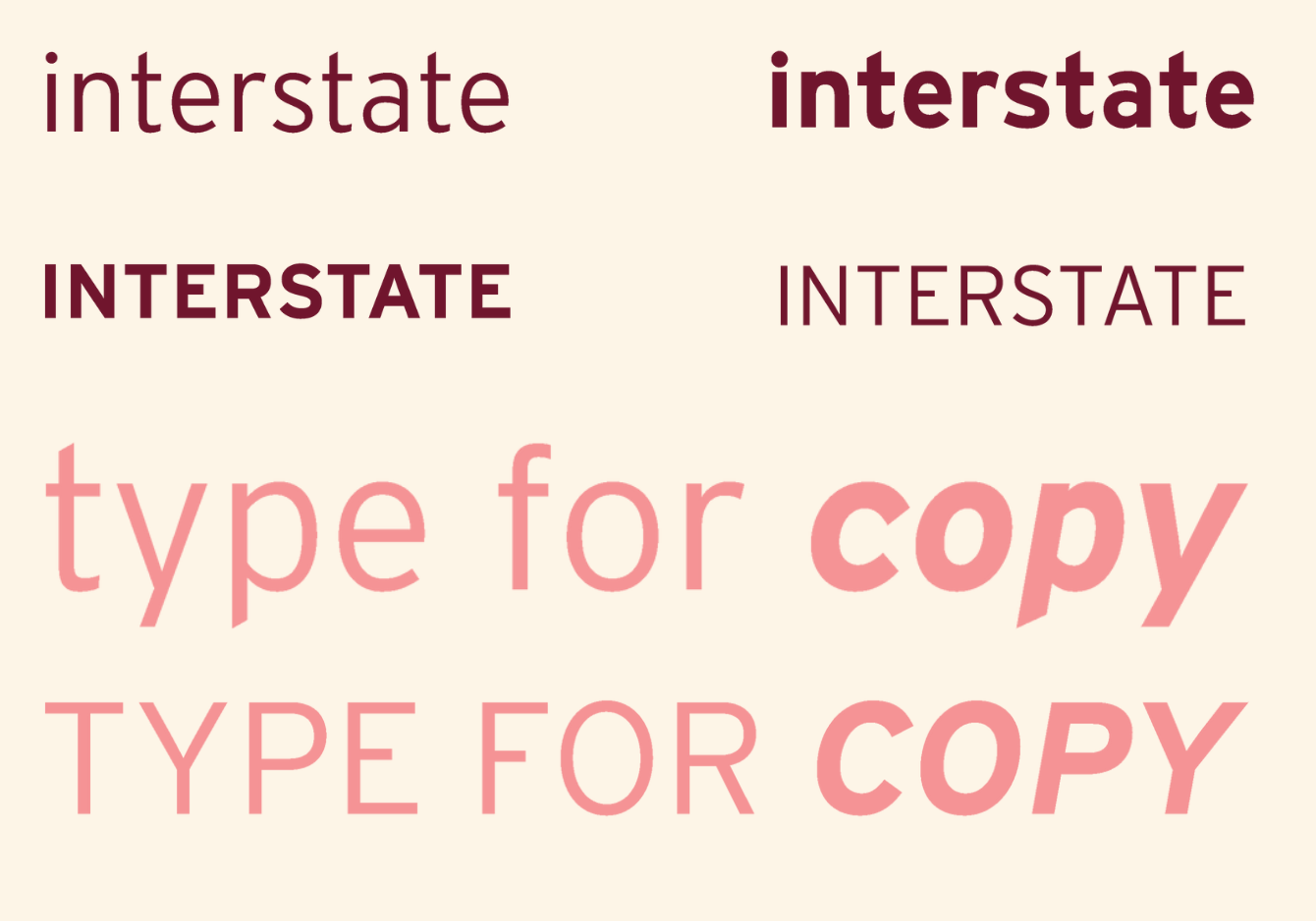
When choosing the color scheme for the Instagram account, I drew inspiration from the previous posts featured on the Instagram account to provide consistency while also incorporating a new and updated feel to the account. Additionally, for the typeface, I chose "Interstate" since it is a sans-serif font that is easy to read on a smaller screen, while also having a variety of weights to emphasize certain points being made and to get people's attention. For the overall brand identity, I wanted to make sure the colors, type, and graphics would be recognizable and tied to this social media with a clear distinction that the information being shared on the Instagram accounts was coming from a professional in the industry.
Creating Graphic Elements
Below you can see the graphics I designed to be featured in posts on the account. All of the graphics are consistent with each other while also incorporating the color palette that was established earlier. These graphics were used in different ways throughout each of the designed posts to support the message being presented while also engaging the viewer or attracting new visitors to the Instagram account.
Design & Prototype
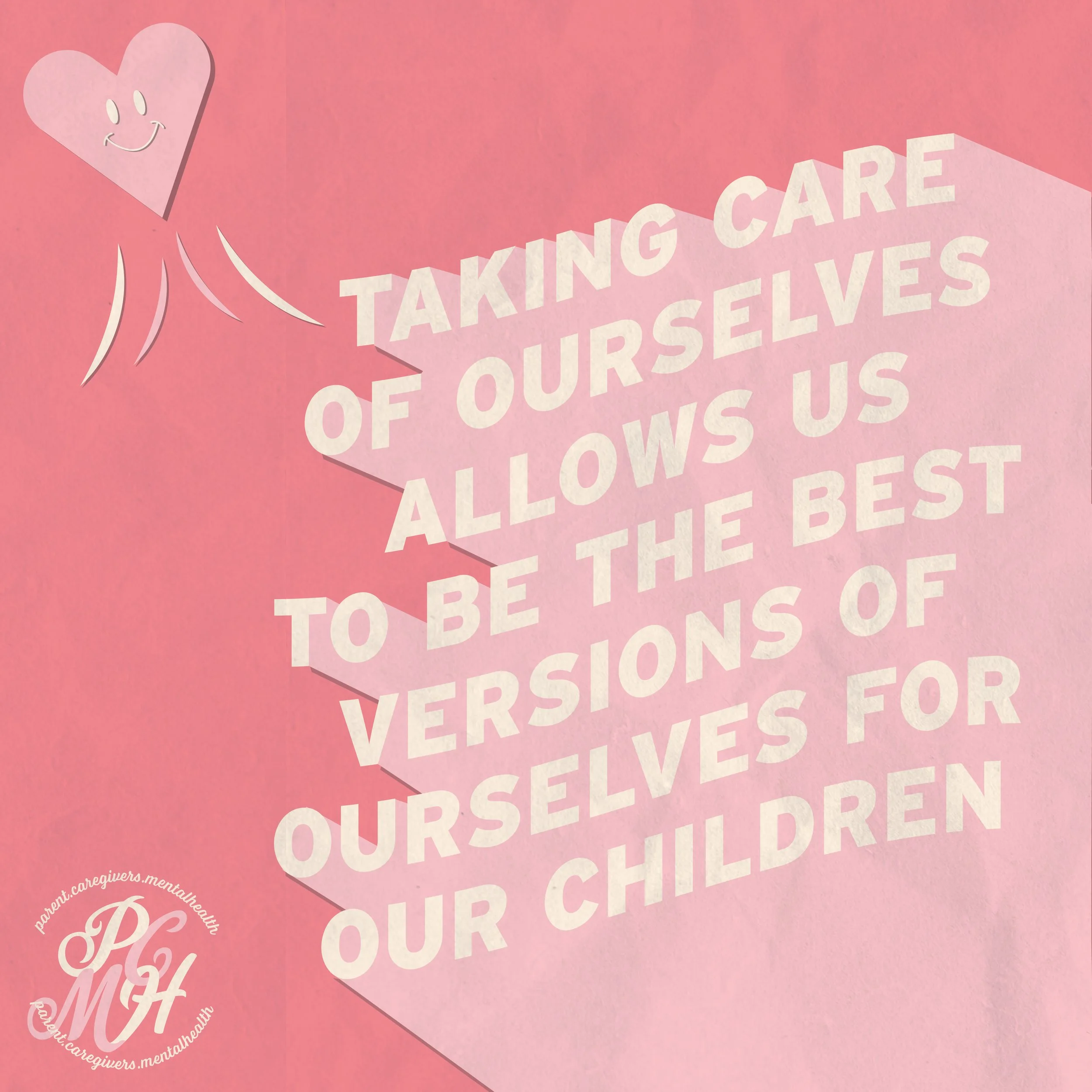
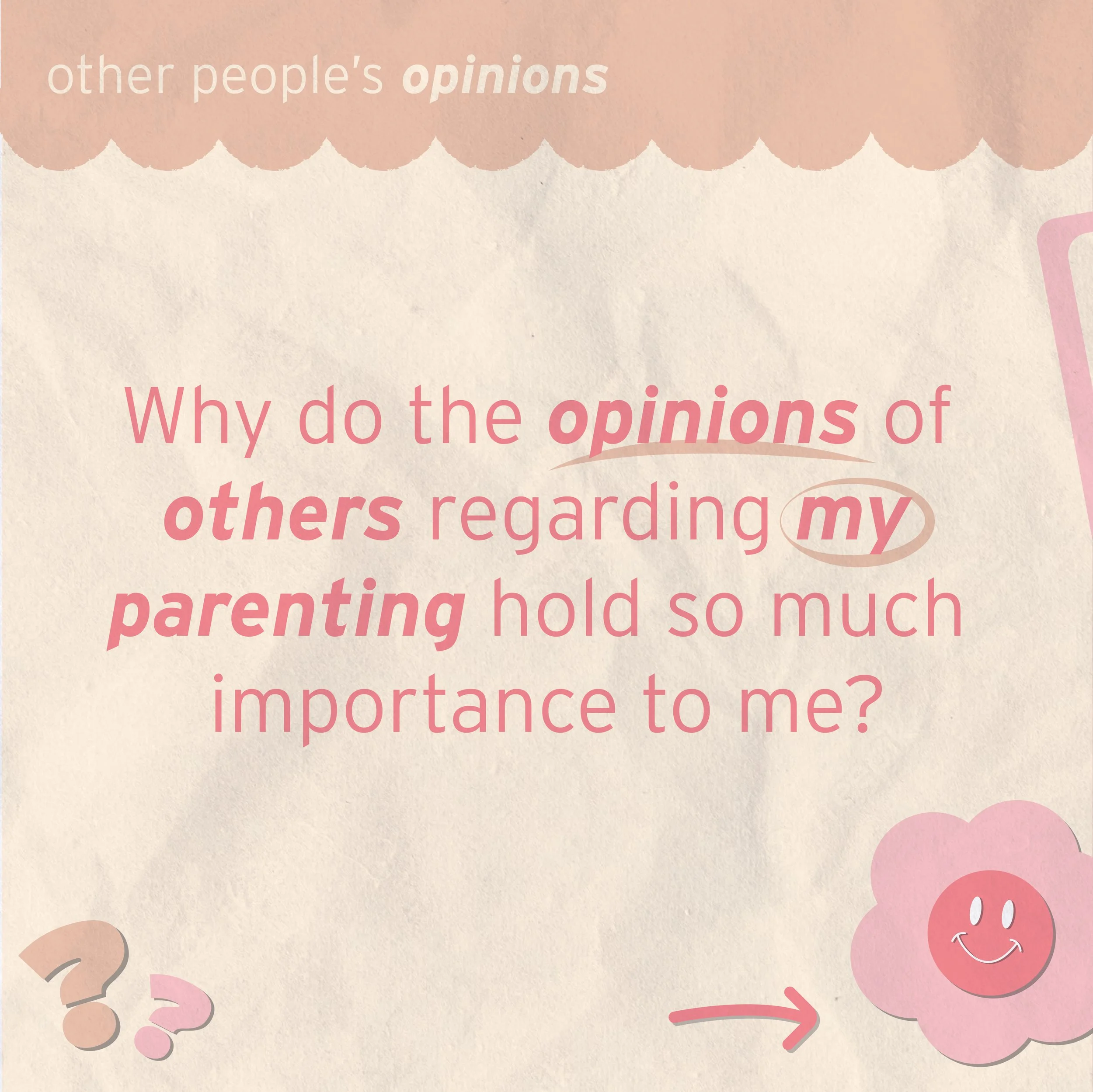
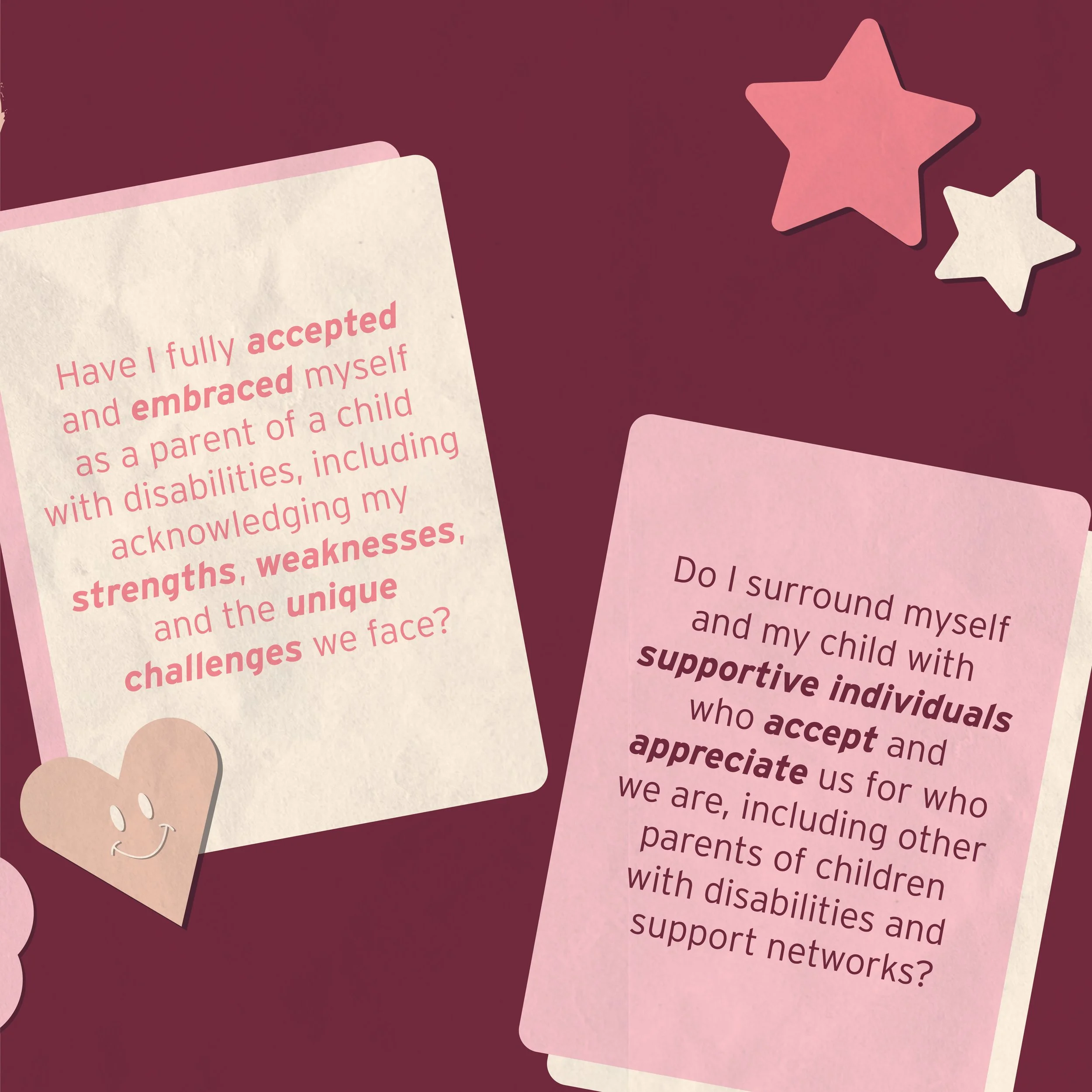
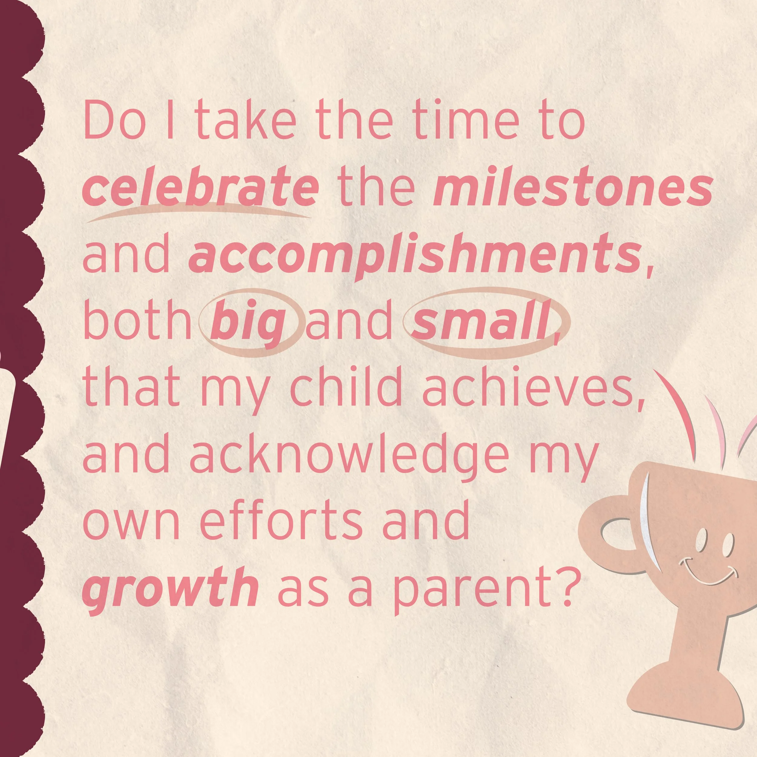
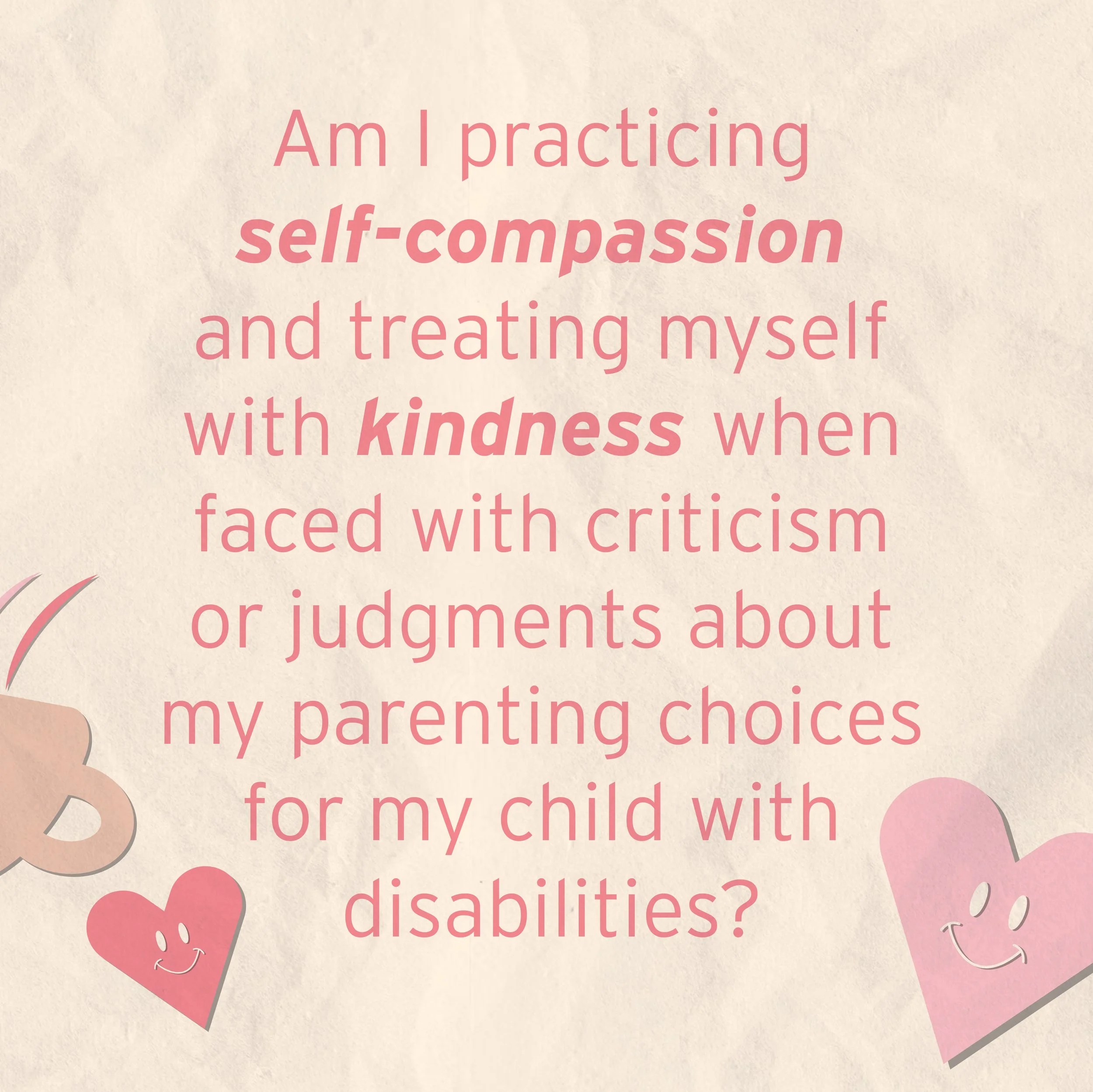
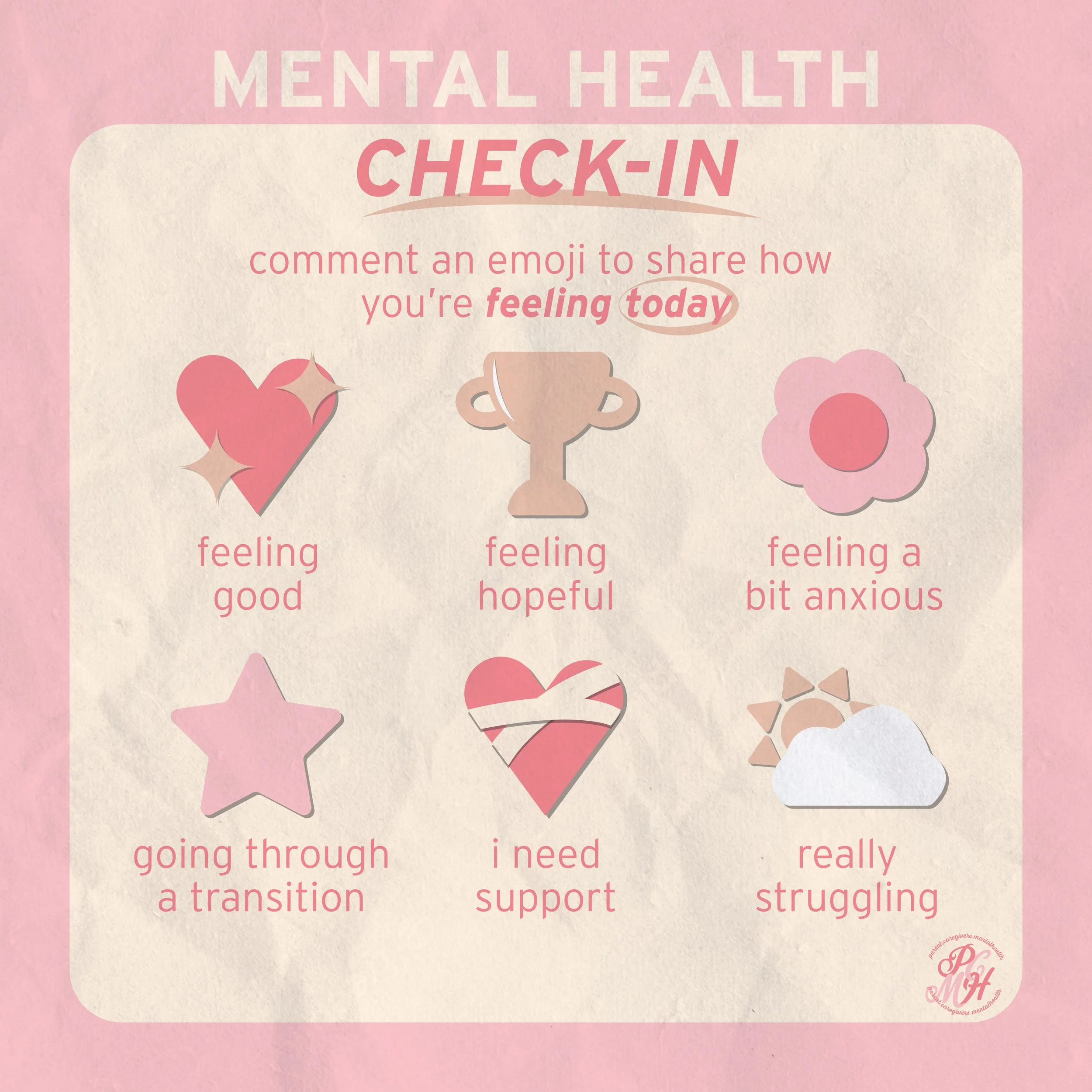
Below are the posts I designed for each of the Instagram posts during my internship. The first line of squares was a single post that featured a continuous swipe to each of the following pages, so each slide was connected to the previous or upcoming slide in some sort of way to increase engagement. The posts below were single posts that stood by themselves as well as a video that was posted as an Instagram Reel and performed well as it attracted new followers through the use of Reels.


