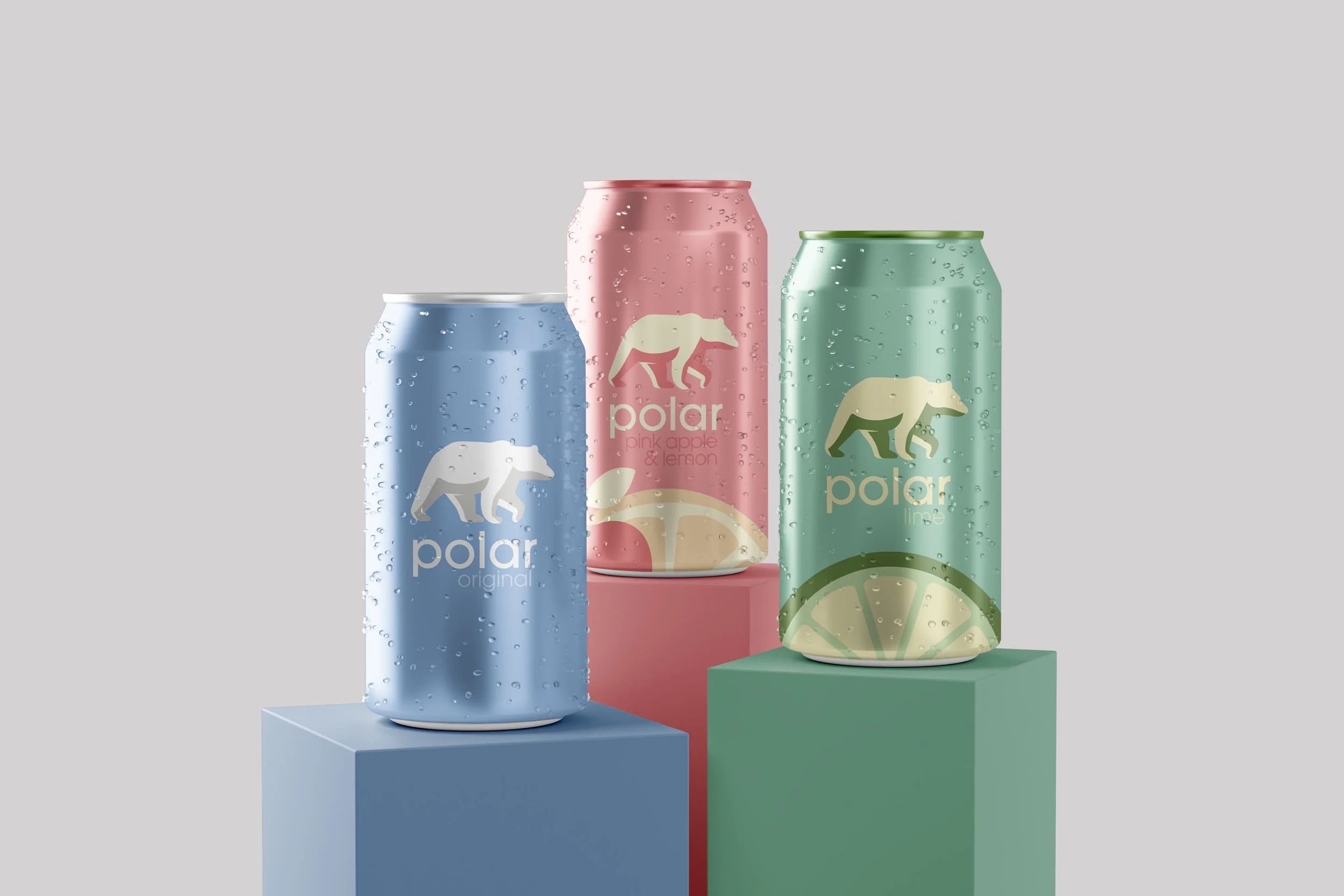
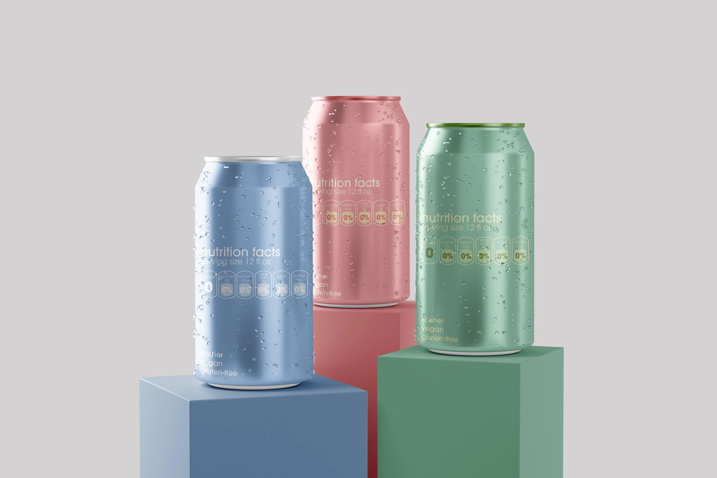
Polar Seltzer Package Redesign
My Role: Research, Package Design
Tools: Pinterest, Behance, Adobe Illustrator, Adobe Photoshop
Timeline: November 2022 - December 2022
Background
Polar Seltzer was founded in 1882 and is considered one of the most popular seltzer brands on the market. The company contains a wide range of flavors for their water seltzers for people with a variety of flavor preferences ranging from Original to Toasted Coconut and the “All-Star Fan Favorites” being Pink Apple & Lemon and Ginger Lime Mule. Polar Seltzer’s mission statement is “as consumer tastes have evolved, so has our ability to innovate and meet the growing demand for sparkling refreshment” which is reflected in their products.
The Process
Problem Statement
Although the Polar Seltzer branding has been around for many years, it has not been updated and has outdated elements that don’t align with more current branding for seltzers on the market. In fact, their logo and packaging have not been changed over the years at all. In order to successfully stand out on the shelves against competing brands, Polar’s package design needs to reflect its popularity and draw in new consumers. My goal for this project was to experiment with color and gain a deeper understanding of how the typeface and logo for a brand play a major role in brand identity and package design.
Research
I began my design process by looking at Polar’s current branding and packaging to gain a better idea of how they present themselves in the market and showcase their products. I wanted to make sure I fully understood their design choices to be able to get started on the redesign process. Additionally, I did research on package design, specifically on cans, through Pinterest and Behance to understand what works and what doesn’t work on can designs.
Objective
Improve the package design of Polar Seltzer cans and feel more modern in the water seltzer market.
Competitor Analysis
To gain more insight into the world of water seltzers, I conducted a competitor analysis of three different seltzer brands to see how Polar compares to them in terms of package design, popularity, and flavor profiles. The three brands I chose for this analysis were bubly, La Croix, and Spindrift. All three of these brands have effective, eye-catching packaging as well as clear brand identity present in their products.


Color Studies
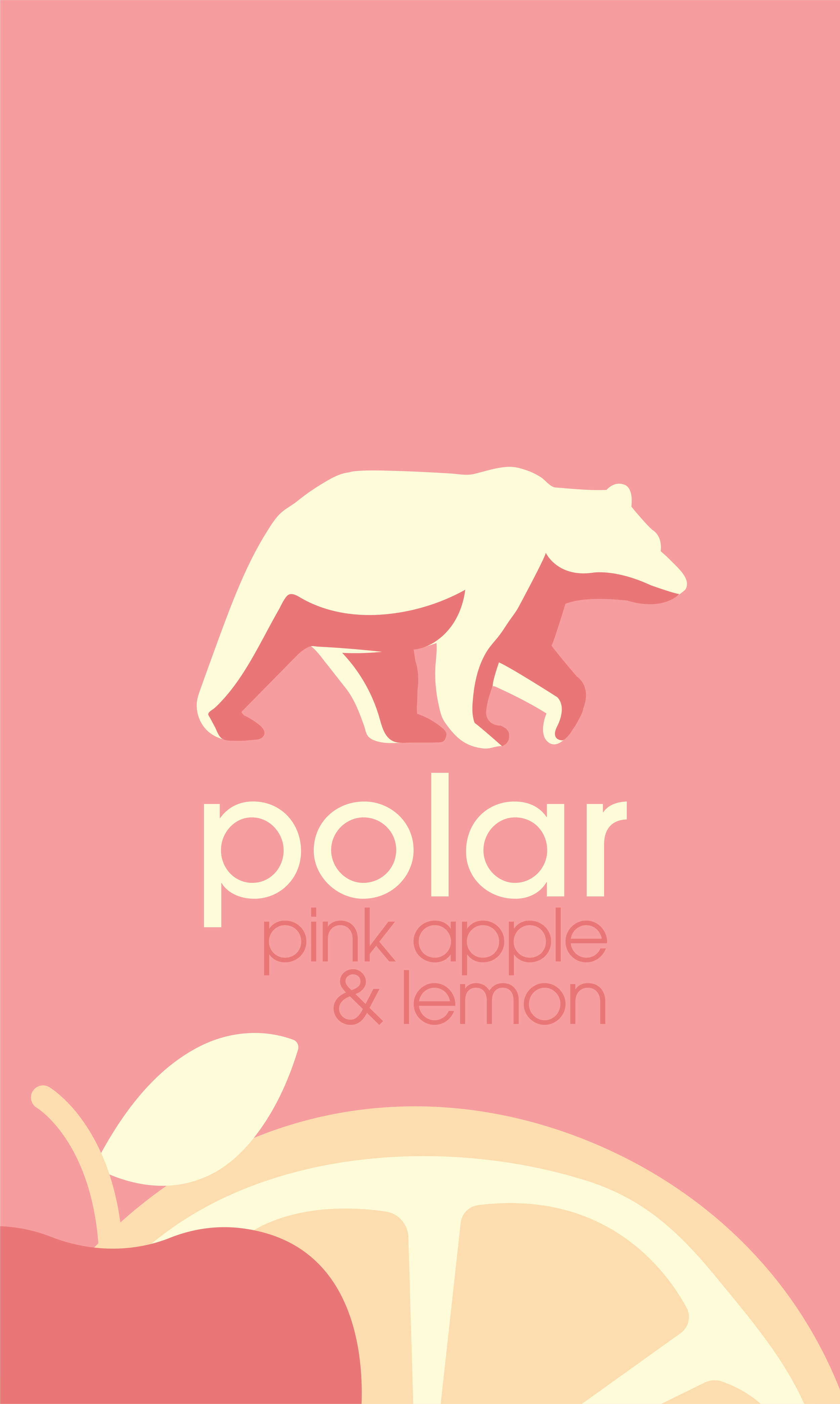
When deciding which colors to use when designing the packaging for Polar, I was inspired by the vibrant colors used in other seltzer brands to display their variety of flavors. For the package redesign, I chose colors that correlated to the flavors I would be focusing on which were Original, Lime, and Apple & Lemon, and made sure all of the color swatches complimented each other while also staying with the theme of the flavor. I also made sure all of the colors accurately represented the new branding as well as clearly communicated to the viewer the flavor of the seltzer.
Type Studies
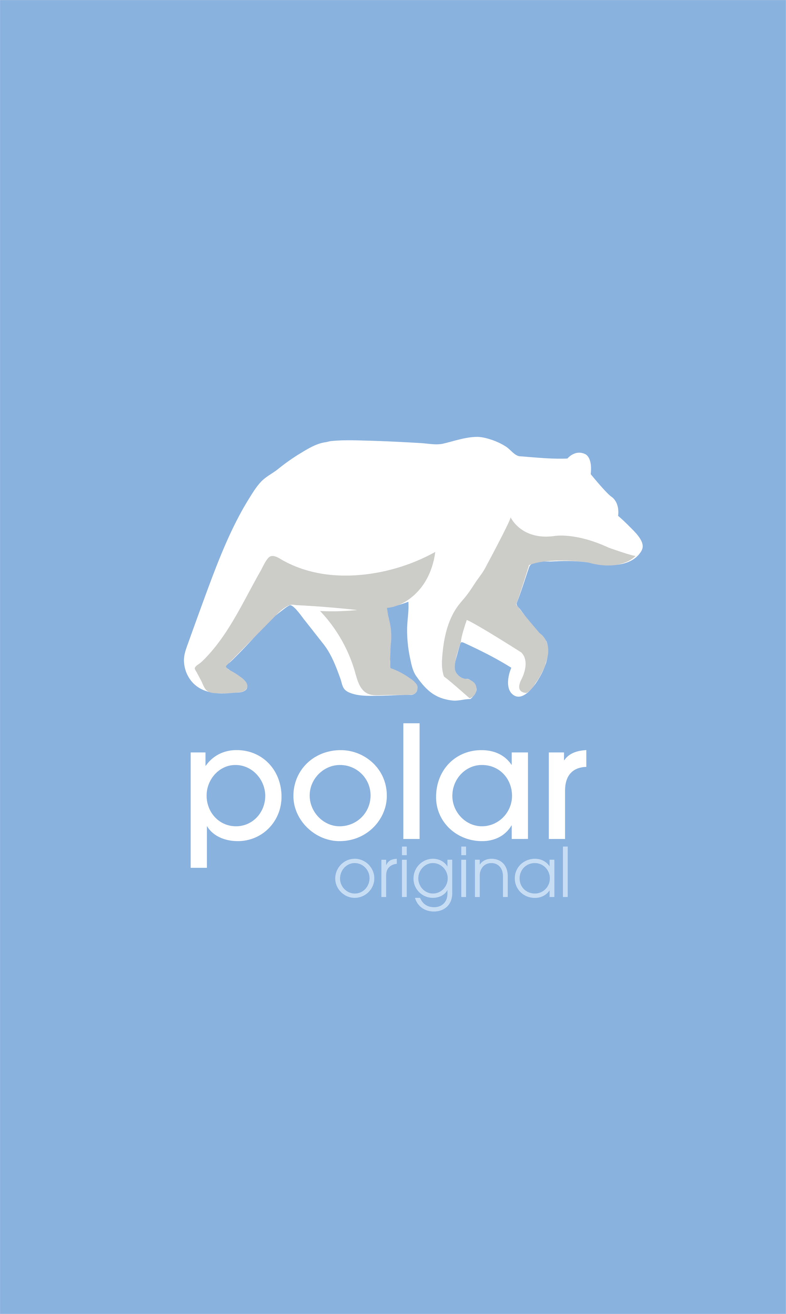
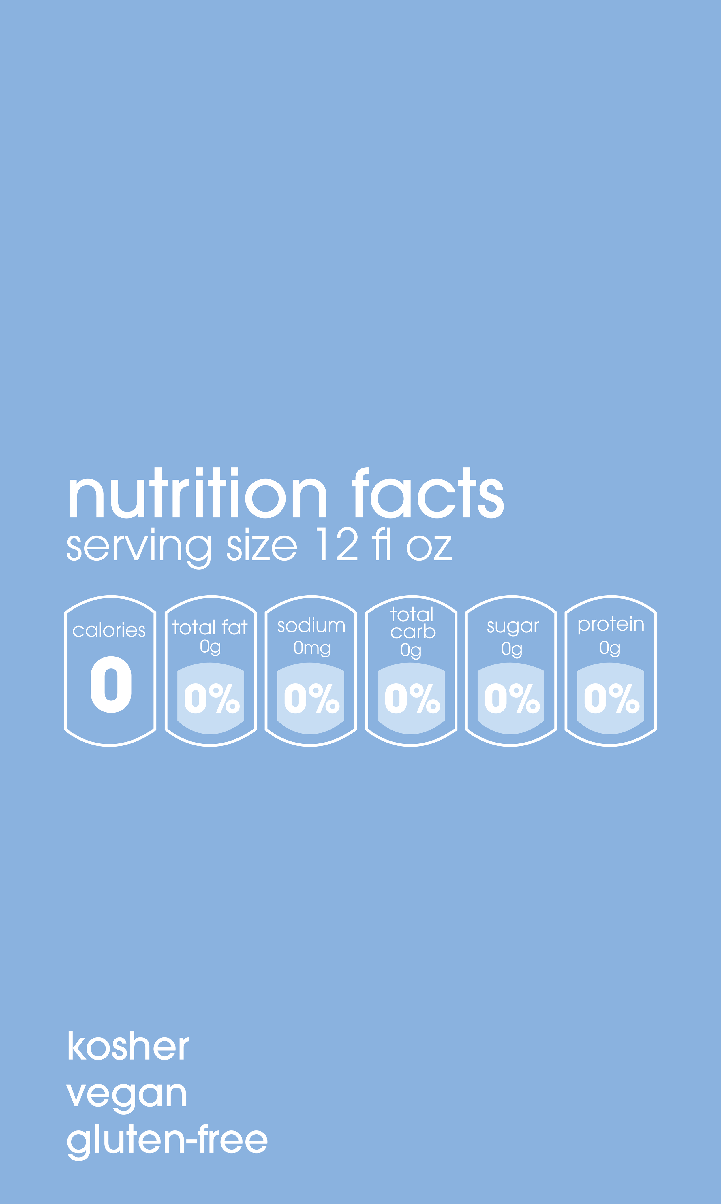
My goal for choosing a typeface for the packaging was to use a sanserif typeface to bring s modern theme to the brand that has been around for many years. I ultimately chose ITC Avant Garde Gothic Pro because I believe this typeface has a modern element to it, which can especially be seen in the Medium and Bold fonts that are in the font family.
Design & Prototyping
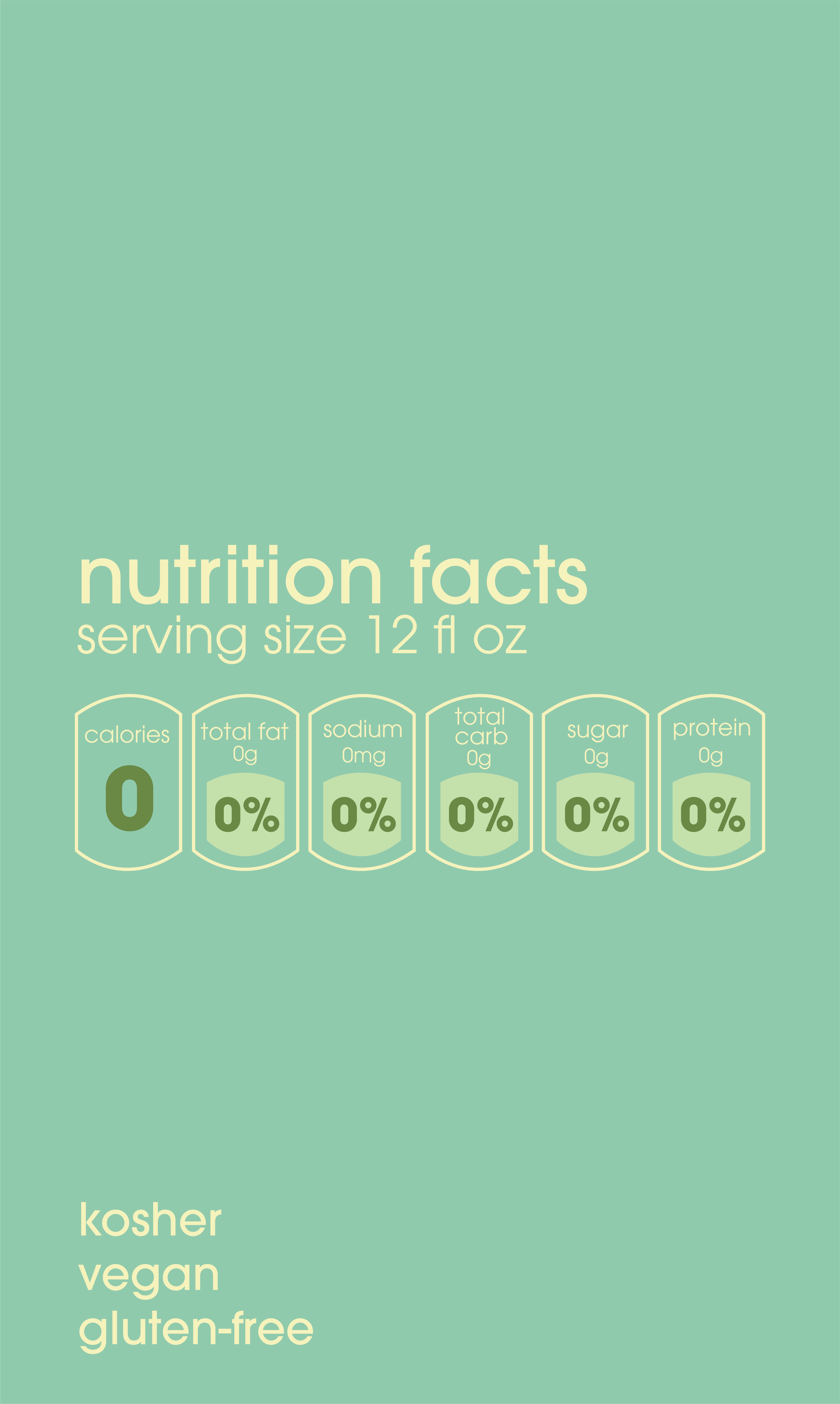
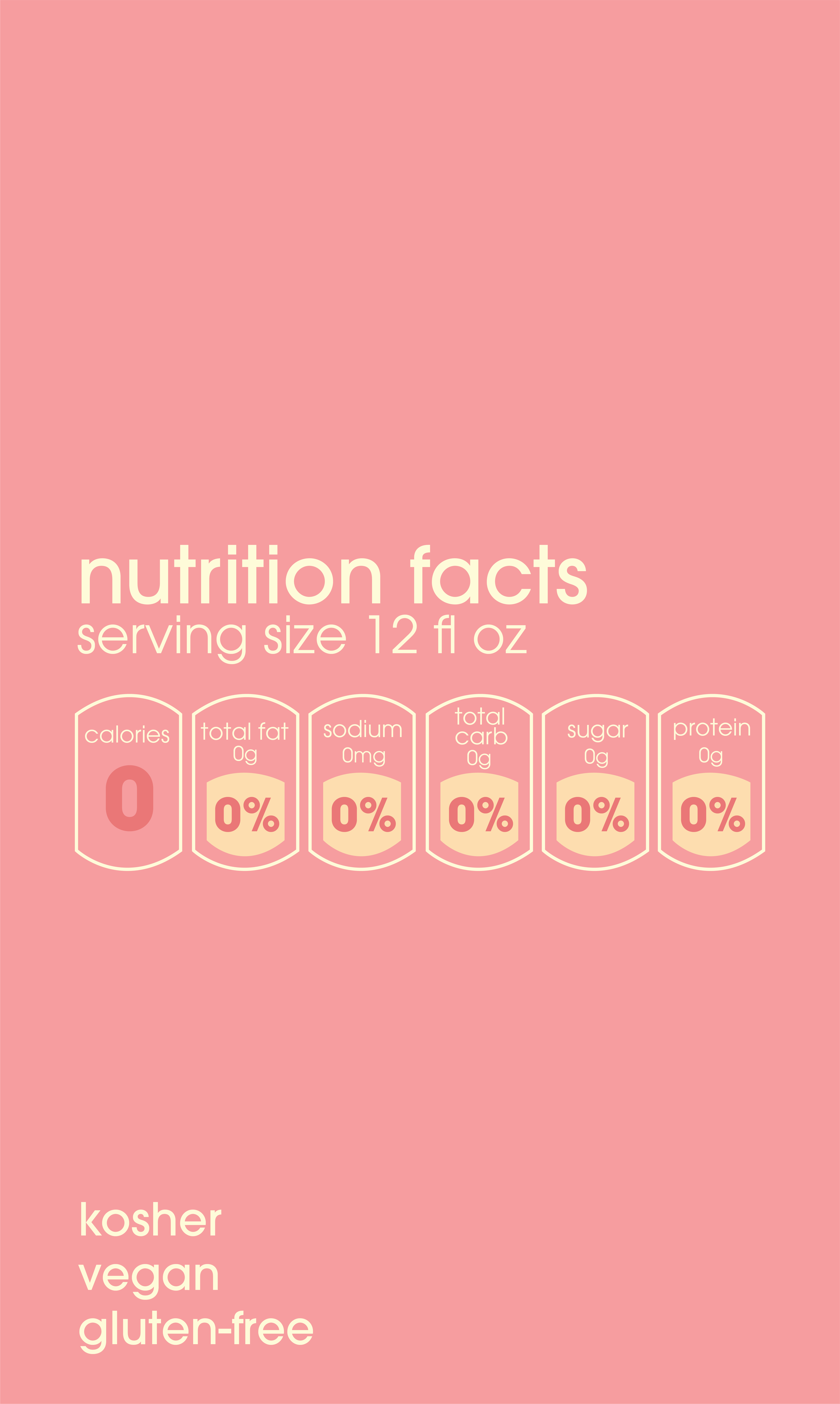
After receiving feedback on my initial design, I made edits accordingly and you can view my final prototype here!


